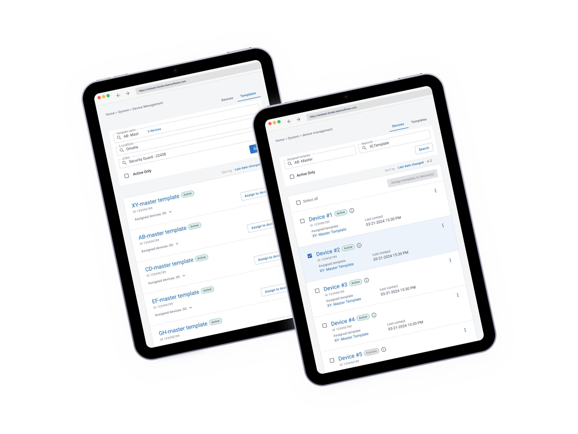
Elearn App
Bootcamp Learning Platform
Designing the learning and management app for Jalasoft and Jala University's tech bootcamps — serving students, teachers, and program administrators in one connected system.
Client
Jalasoft / Jala University
My Role
Lead Product Designer
Timeline
2023
Deliverables
UX Research · IA · UI Design · Design System

Overview
The project at a glance
Context
Jalasoft and Jala University run technology bootcamps across LATAM, training students in disciplines like UX/UI design. Running a bootcamp at scale means coordinating three different groups — students, teachers, and administrators — each with different needs and pain points, often with no dedicated platform connecting them.
My Contribution
I owned the project solo, end-to-end — from conducting every stakeholder interview through synthesis, prioritization, journey mapping, wireframing, and final UI. There was no dedicated PM on this initiative; I drove both the research and the product direction myself.

How do we give students, teachers, and bootcamp coordinators each what they actually need — without building three disconnected tools?
The product's core differentiator: a single platform that serves three structurally different jobs-to-be-done — learning (student), teaching (teacher), and operating (admin) — without forcing any of them into a generic, one-size-fits-all interface.
The Challenge
Three users, one gap
Each stakeholder group had a different surface-level complaint. Seen together, they pointed to one structural problem.
Problem 01
No structured onboarding. Students lacked a clear path into the program; teachers had no standard onboarding; admins had no repeatable way to set up a new cohort.
Problem 02
Fragmented communication. Student-to-teacher, teacher-to-teacher, and teacher-to-admin communication had no shared channel — just ad hoc messages.
Problem 03
No visibility into progress or risk. Admins had no system to track student progress or flag at-risk students until it was too late to intervene.
Reduce onboarding friction.
Get new students, teachers, and admins productive on day one, without informal hand-holding.
Prevent dropouts through visibility.
Surface progress and risk signals early enough for admins and teachers to act, not just report.
Design Process
From three perspectives to
one system
Researched all three stakeholder groups in parallel, synthesized the findings into one model, then designed surface by surface.
01
Understanding Three Different Users
Conducted structured interviews with teachers, students, and bootcamp administrators covering onboarding experience, communication patterns, and the specific frustrations of running or attending a tech bootcamp..
02
Synthesizing Three Perspectives
Synthesized interview data through affinity mapping, built proto-personas for each user type, and used a Value Proposition Canvas to define what the product needed to deliver. Ran prioritization and "How Might We" sessions to turn problems into solution directions..
03
Mapping Journeys & Wireframing
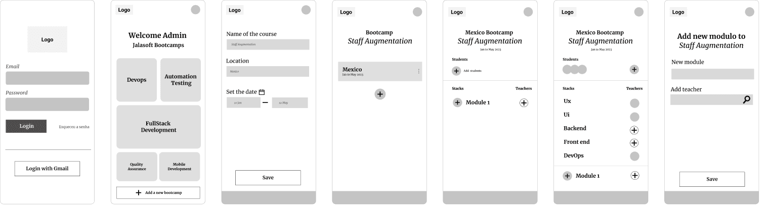
Mapped end-to-end journeys for key flows — including bootcamp setup, from creating a course to assigning stacks, students, and teachers. Built wireframes for the highest-priority flows, then evolved them into high-fidelity layouts using the Jalasoft design system.


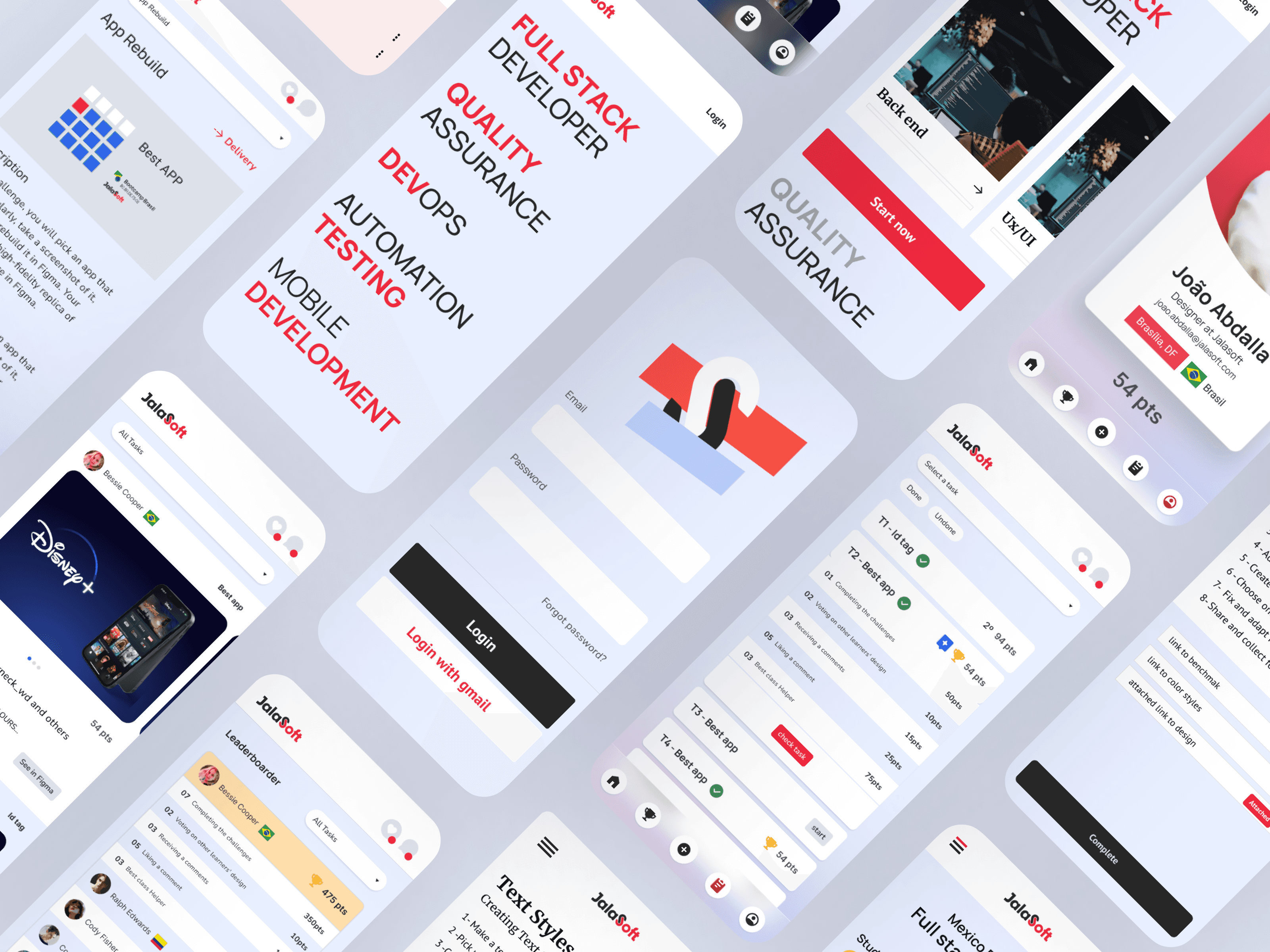
Jalasoft brand system · Typography (Manrope/Nunito) and color tokens applied to the Elearn App
04
Concept Approved for Roadmap
Built high-fidelity screens across Student, Teacher, and Admin surfaces using the Jalasoft design system. Each role had its own distinct interface — students see task progression and evaluation, teachers see curriculum management and student oversight, admins see bootcamp-wide operations and analytics. The design system ensured visual consistency and component reusability across all three surfaces without forcing them into a one-size-fits-all mold.
Design Decisions
Key choices and why
The reasoning behind the most important decisions — not just what was designed, but the thinking that got there.
Decision 01
Rebalancing Practice vs. Theory by Discipline
Research showed students wanted less abstract theory and more hands-on, real-project work — but the gap wasn't equal across disciplines. The original curriculum split UI and UX 50/50 between theory and practice. Based on what students and teachers described, I drove a shift toward heavier practice for UI, while UX kept a stronger theoretical base. This was a discipline-specific rebalancing the data actually supported, and it reshaped how content and progress tracking needed to work inside the app.

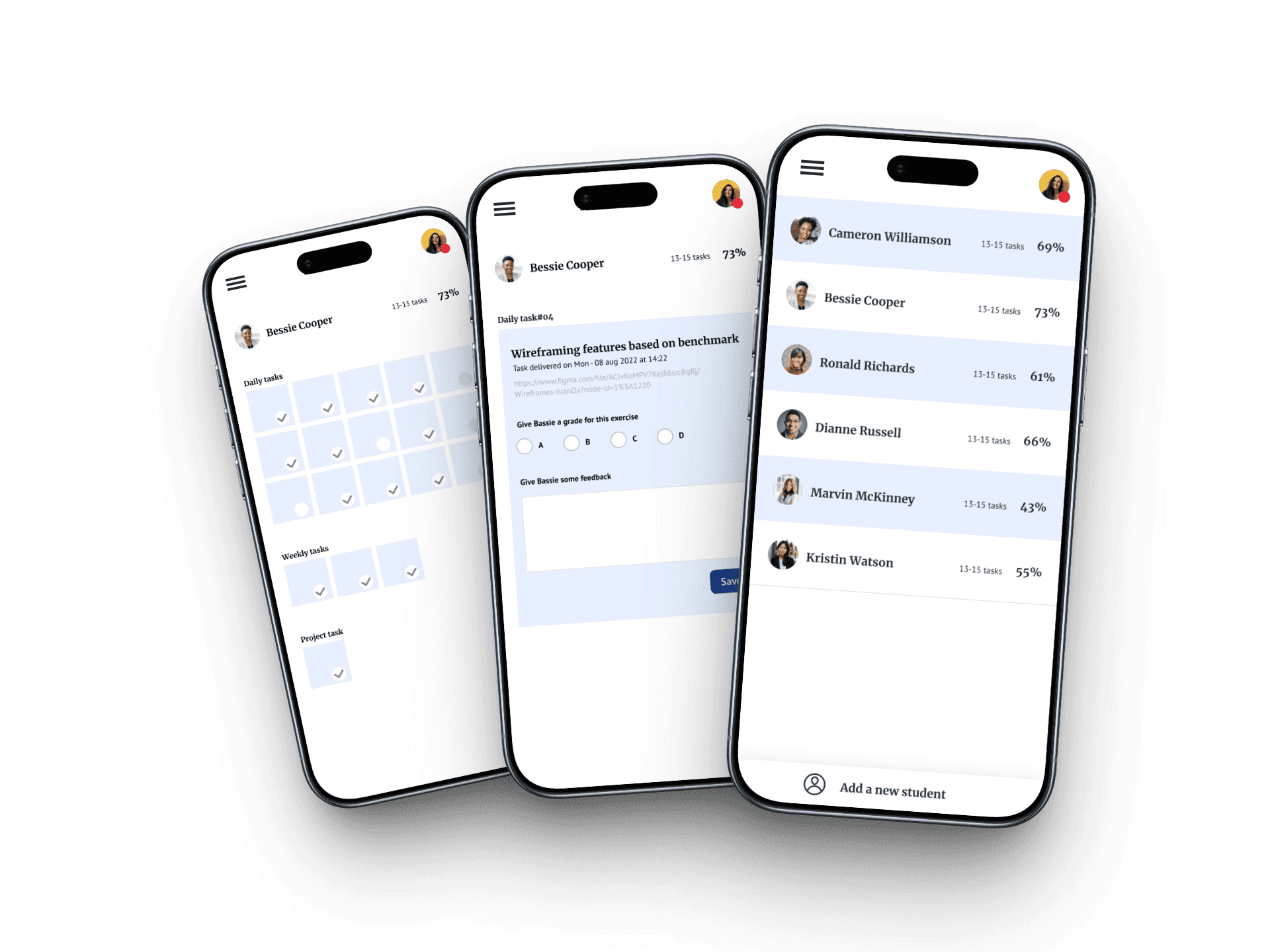
Decision 02
Teacher-Owned Curriculum Content
Teachers reported no structured syllabus and no content program across cohorts — each class started from scratch. Rather than having Jalasoft or admins centrally author curriculum content, I designed the app so teachers own and upload their own course content directly into the system. This put control where the actual subject-matter expertise lived, while giving the platform a structured place for that content to exist.

Decision 03
Step-by-Step Bootcamp Setup, with Continuity
Setting up a new bootcamp cohort involves several layered decisions: the course itself, its stacks (tracks), and the teachers and students assigned to each. Rather than one long form covering everything at once, I designed the setup flow in stages — course first, then stacks, then teacher and student assignment. The stages weren't isolated screens, though: each one carried context forward from the last, so admins moved through a single continuous flow rather than a series of disconnected forms.
Outcome
Proven in the classroom
The Elearn App began as the capstone project of the UX/UI bootcamp I taught at Jalasoft — and the curriculum decisions behind it, like the UI/UX practice-theory rebalance, were validated directly in front of real students across Brazil and Colombia. The app itself was approved and entered Jalasoft's product roadmap for development; I left the company before the build phase began, so I can't speak to its status as a shipped product. But the thinking behind it had already proven out, repeatedly, in the classroom.
What it led to
The recognition opened the door to two different kinds of invitations. The first was designing Blue Print, the design system for Jala University's undergraduate program — the foundation its students would build their final projects on top of, including light and dark mode token variants and core layout. The second was being asked to extend the same UI/UX training I taught students into a course for Jalasoft's own employees — packaging the bootcamp curriculum as an internal learning resource for the company itself. Teaching the bootcamp didn't just validate a curriculum; it became the reason I was trusted with infrastructure other students' work would depend on, and with training the company's own team.

9
Cohorts Taught
Bootcamp cycles where the curriculum decisions were tested live
100+
Students
Trained across all 9 cohorts
2×
Multi-Country Reach
Cohorts run across Brazil and LATAM, expanded to Jalasoft and Jala Group employees
✓
Top-Rated Teacher
Recognized as the bootcamp's best teacher by students and peers

Learnings
What I took away
What worked well
Researching in Parallel, Not in Sequence
Researching all three stakeholder groups in parallel — students, teachers, and admins — surfaced things no single perspective would have shown. Each finding looked like a separate fix in isolation, but seen together, they pointed to one underlying gap — no shared system connecting how content was taught, owned, and tracked.
What I'd do differently
Earlier Validation with Real Users
With more time before development began, I would have validated the high-fidelity proposal directly with a small group of real teachers and students to pressure-test the curriculum-ownership model and the setup flow before they reached final approval.
Key insight
The Best Version Wasn't the First
I came back to this project multiple times, refining the research synthesis, the user flows, and the UI as my own thinking sharpened. A multi-stakeholder product like this rarely gets fully right in one pass — revisiting and polishing over time was as much a part of the process as the initial discovery.
Room to grow
Designing for Pedagogy, Not Just UI
This project pushed me past UI and UX patterns into curriculum design itself — how content is structured, paced, and balanced between theory and practice. Deciding to rebalance UI and UX coursework bordered on pedagogy. It's an area I want to go deeper in.