AquaryU
Astrology-Based Dating
Designing a dating app where compatibility comes from synastry, not swipes, built end-to-end from concept to clickable prototype.
Client
Independent founder
My Role
Lead UX/UI Designer
Timeline
2018
Deliverables
User Flows · Information Architecture · UI Design · Interactive Prototype

Dating app
Find Your Cosmic Connection
Overview
The project at a glance
Context
Dating apps reduce compatibility to a photo and a bio. AquaryU's founder wanted to test a different premise: that synastry — the astrological comparison of two birth charts — could surface more meaningful matches than a swipe ever could. My job was to turn that abstract concept into something a user could actually understand and trust in under 30 seconds
My Contribution
I owned the end-to-end UX and UI design: user flows, information architecture, high-fidelity screens, and an interactive prototype covering discovery, compatibility scoring, profile setup, matching, and in-app chat. I worked solo, with no dedicated PM, collaborating directly with the founder on both product direction and design decisions.
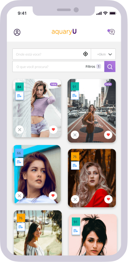
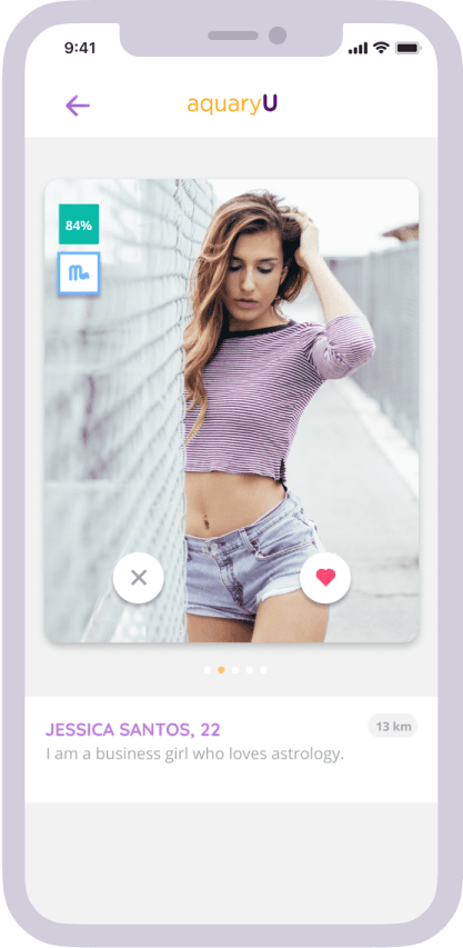
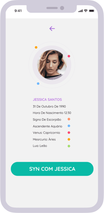
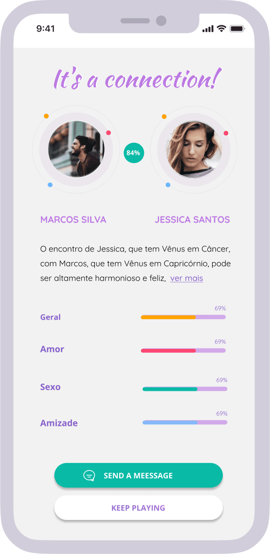
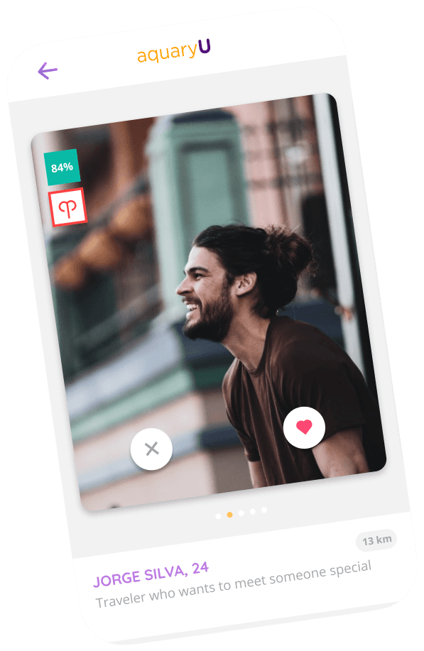
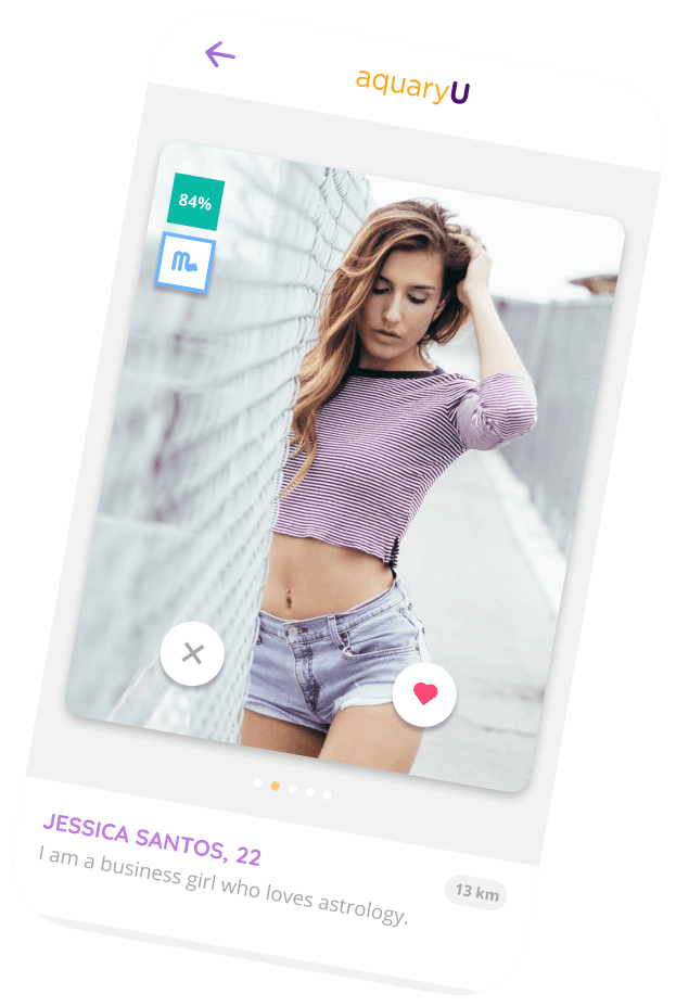
The product's core differentiator is the compatibility engine: users get a synastry-based match score instead of a swipe deck, making a subjective decision (attraction) feel more grounded and intentional
The Challenge
Surface-level apps,
surface-level matches
Most mainstream dating apps optimize for the first five seconds — a photo, a one-line bio, a swipe. That format rewards surface-level attraction and gives almost no signal about whether two people would actually be compatible once the swiping stops.
Problem 01
Surface-level matching
Most dating apps optimize for first impressions — photos, bios, proximity — with no signal for deeper compatibility.
Problem 02
No depth for an audience that wants depth.
The target audience — young people already engaged with astrology and self-discovery — had no dating product that took that interest seriously, rather than treating it as a gimmick.
Problem 03
Compatibility discovered too late
On typical apps, real compatibility is something people stumble into after several conversations — not something the product helps surface up front.
Goals & Metrics
What success looked like
What worked well
Make synastry legible, fast
Turn a traditionally dense, narrative astrological comparison into something a person could understand and act on in seconds — not minutes of reading.
What I'd do differently
Make astrology the mechanism, not decoration
Compatibility needed to genuinely drive who people saw and matched with — not sit next to a conventional swipe feed as a side feature.
Design Process
From birth charts to
a clickable product
01
Researching Apps and Astrology
Researched existing dating apps to understand where the format breaks down, and studied astrological synastry in depth — how birth charts are compared, what makes a reading feel credible versus generic, and how that logic could translate into a digital compatibility signal.
02
Mapping Flows Around the Score
Mapped the core flows the product needed: onboarding (collecting birth data), discovery, compatibility scoring, match, and chat. Defined the information architecture around a single idea — the compatibility score needed to sit at the center of the experience, not as an add-on to a conventional swipe feed.
03
Iterating Directly With the Founder
Designed the experience from wireframes through to high-fidelity UI, working directly with the founder in fast iterative rounds — reviewing and refining each flow with him before moving to the next.
04
A Fully Clickable Prototype
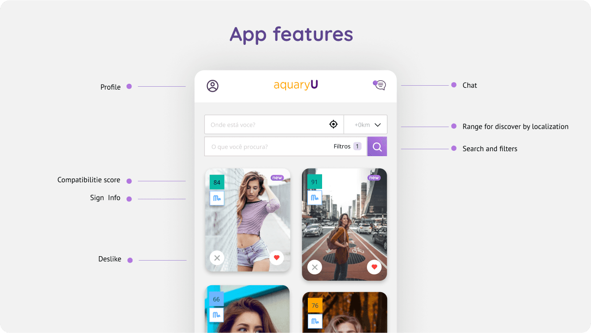
Delivered a fully clickable prototype covering onboarding, discovery, compatibility scoring, matching, and chat. The founder navigated and approved the prototype directly; the project didn't reach a stage of testing with real end users before development was meant to begin.
Design Decisions
Key choices and why
The reasoning behind the most important decisions — not just what was designed, but the thinking that got there.
Decision 01
A Compatibility Score, Not Just a Reading
Synastry is naturally narrative — two birth charts compared in depth. But a dating app needed something a person could scan in under a second before deciding whether to engage. I designed the core compatibility signal as a number (e.g., 87% compatible), with the fuller astrological narrative available underneath for people who wanted to go deeper. The score did the job swiping does on other apps — a fast first filter — while the narrative gave it substance a swipe never has.


Decision 02
Score Shown Before the Match, Not After
I designed the compatibility score to appear before a match was confirmed, not as a reward unlocked afterward. On a normal dating app, attraction comes first and compatibility (if it exists at all) is discovered later, often too late. Here, the score became part of the decision itself — people chose who to engage with already knowing the compatibility read. It moved synastry from being a nice extra to being the actual basis for the decision to connect.

Decision 03
Short, Sequential Onboarding for Sensitive Birth Data
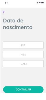
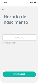
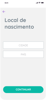
Synastry requires birth date, time, and location — data most apps never ask for, and that can feel invasive if requested all at once. I broke the onboarding into short steps, one question per screen, rather than a single dense form. Each step asked for one piece of information in isolation, which kept the process feeling like a guided conversation rather than paperwork.
Decision 04
Leaning Into the Astrological Tone, Not Softening It
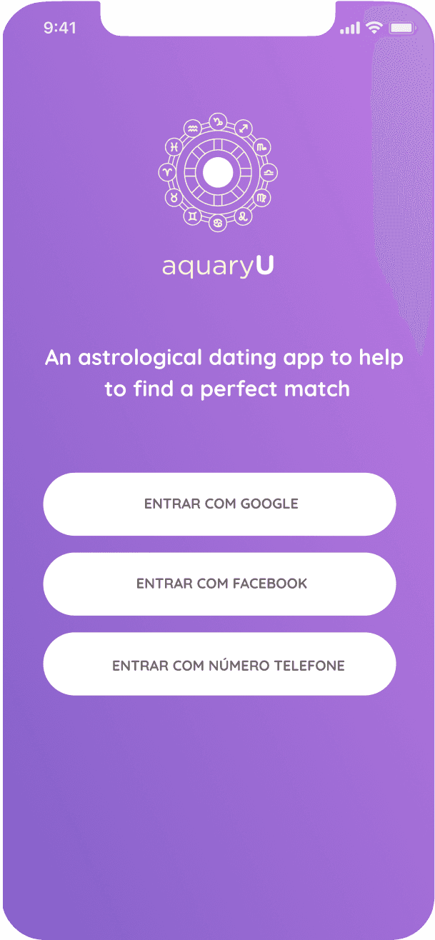
The client's direction was clear: the product should feel astrological and mystical, not like a generic dating app with a horoscope feature bolted on. Rather than hedge that tone down to appear more "serious," I designed into it — language, iconography, and visual style all leaned toward the astrological framing, trusting that the audience self-selecting into an astrology-based app already wanted that experience.

Outcome
A complete prototype
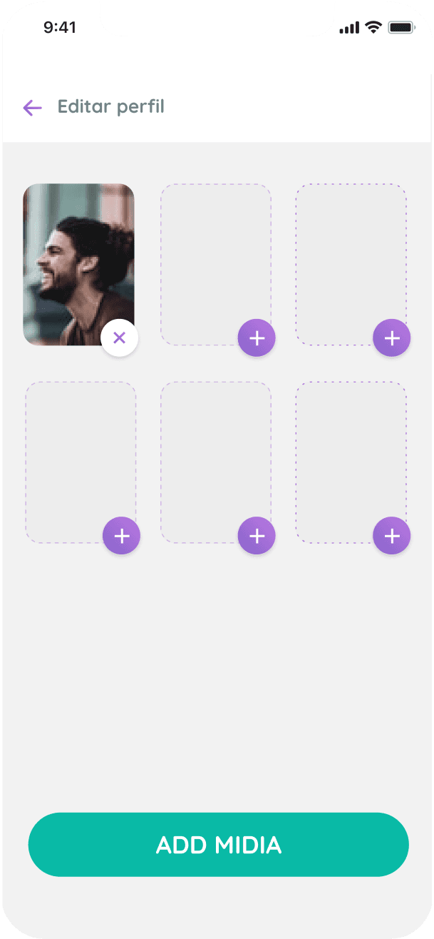
The project reached a fully navigable prototype, covering discovery, compatibility scoring, profile setup, matching, and chat. The client didn't move forward into development — he took a full-time job and stepped away from the project before it reached the build phase. The design itself was never the blocker; it was a side-project priority that lost out to a stable opportunity, which happens often with early-stage founder-led products.

Learnings
What I took away
What worked well
A Fast, Scannable Signal
Designing the score as a fast, scannable signal — not burying compatibility inside a long narrative reading — meant the core value of the product was visible in the first few seconds of using it. Speed-to-value matters even in a product built around something as unhurried as astrology.
What I'd do differently
Validate Beyond the Founder
The prototype was navigated and approved by the founder, but never tested with real end users before the project paused. A founder's reaction isn't the same as a target user's. With more time, I'd have tested the prototype with a handful of people from the actual target audience.
Key insight
Matching Logic Is a Trust Mechanism
A dating app's "matching logic" is really a trust mechanism in disguise. Whether it's photos, a swipe, or a synastry score, the real design question is always: what convinces someone it's safe and worthwhile to engage with a stranger?
Room to grow
Designing for Belief, Not Just Behavior
This was my first project designing a product where the value proposition depended on a belief system rather than a measurable behavior. I'd like to design more products where value is emotional or experiential first, and learn research methods built for that — not just usability testing built for utilitarian products.